The Top 10 Worst Football Shirts of All Time
Football shirts are more than just sportswear – they embody pride, passion, and nostalgia for fans worldwide. From historic moments on the pitch to the aesthetic evolution of designs, they hold a special place in football culture. But for every iconic shirt, there’s a misstep that leaves fans and players shaking their heads. Whether it’s due to baffling designs, odd colours, or sheer impracticality, some shirts have earned their spot on the all-time worst list. Here’s our pick of the top 10 worst football shirts of all time – and why they’re remembered for all the wrong reasons.

10. Tottenham Away 2022/23: The Modern Template Problem
The Tottenham away kit from 2022/23 is a prime example of modern design laziness. The kit symbolises a troubling trend in football shirt design – the overuse of templated patterns. With only minor changes in colour palettes or branding, kits like this fail to capture the uniqueness fans expect. This generic approach strips away the individuality that clubs have spent years cultivating. For Tottenham, a club with a rich history of clean and iconic kits, this one is a forgettable misstep.
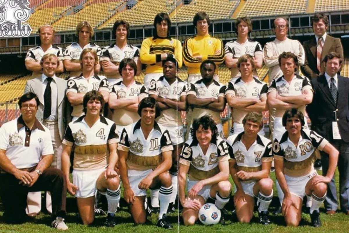
9. Colorado Caribous Home 1978: Flamboyant Disaster
Few kits are as infamous as the Colorado Caribous’ 1978 fringe shirt. Designed to stand out in the short-lived North American Soccer League (NASL), this cowboy-inspired kit featured leather tassels across the chest, making players look ready for a Western showdown rather than a football match. It was kitschy, impractical, and short-lived, but its reputation endures as one of the boldest design failures in football history.
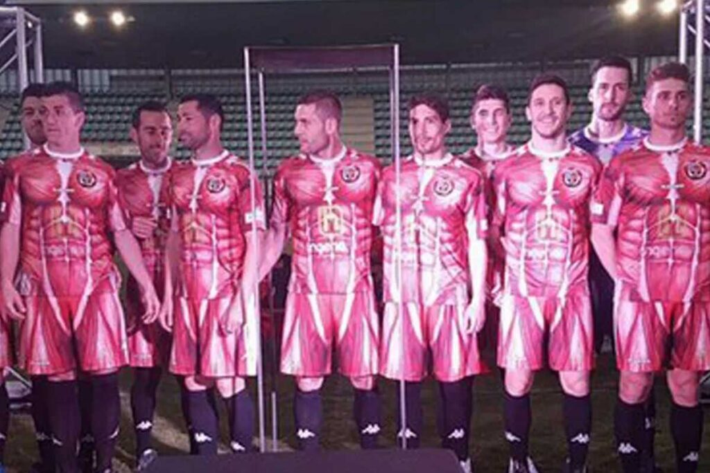
8. CD Palencia Home 2016/17: Inside Out
CD Palencia’s 2016/17 home kit went viral for its bizarre design, which depicted human anatomy. The muscles-and-tendons graphic aimed to highlight the team’s fighting spirit but ended up looking more like a biology lesson gone awry. While it was certainly creative, it didn’t translate well on the pitch, leaving fans and opponents equally perplexed. This is a perfect example of ambition overshadowing aesthetic appeal.
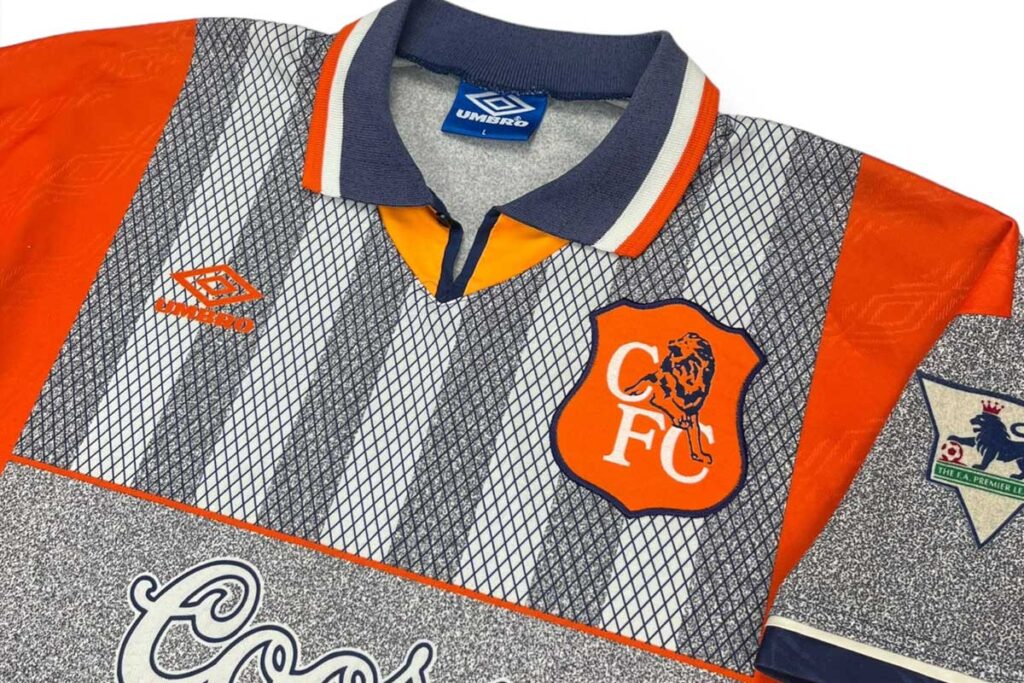
7. Chelsea Away 1994/96: Orange & Grey Awkwardness
Chelsea’s 1994-96 away kit combined a dull grey with a shocking orange, creating a visual clash that left fans scratching their heads. The color pairing was uninspired, and the design failed to represent Chelsea’s otherwise rich history of classic kits. Dubbed the “concrete and carrot stick” shirt, it remains a baffling anomaly in the club’s kit history. For fans of clean and traditional designs, this kit was a nightmare.
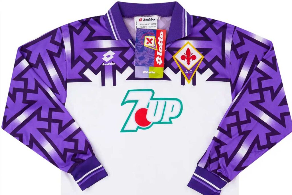
6. Fiorentina Away 1992/93: Suspect Pattern
At first glance, Fiorentina’s away kit from 1992/93 appears to be a simple geometric design. However, closer inspection revealed an accidental pattern resembling swastikas – a PR disaster for the club. While the intent was innocent, the controversy overshadowed the team’s performance that season, making this kit a cautionary tale in the importance of double-checking designs before mass production.
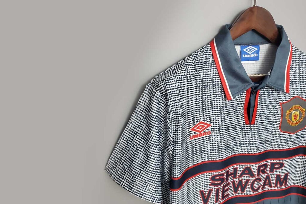
5. Manchester United Away 1995/96: Grey Blur Disaster
Manchester United’s 1995/96 grey away kit wasn’t just unattractive – it was impractical. Famously blamed by Sir Alex Ferguson for a first-half loss to Southampton, players reportedly couldn’t see each other clearly on the pitch due to the kit blending into the background. It’s a rare case of poor design impacting performance, making it a legendary failure in both aesthetics and functionality.
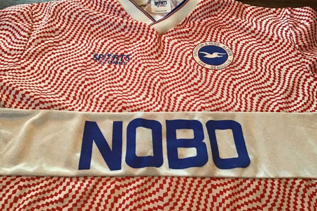
4. Brighton Away 1989/91: A Branding Blunder
Brighton’s NOBO-sponsored pink away kit is a reminder that bad color choices and poor branding can ruin even the most ambitious designs. The bold pink clashed with the sponsor’s logo, creating an awkward and overwhelming visual effect. While the kit has gained cult status among collectors, it’s more for its notoriety than its style.

3. Cameroon Home 2002: Sleeveless Experiment
Cameroon attempted to revolutionise football kits in 2002 with a sleeveless design for the African Cup of Nations. While the concept was innovative, FIFA’s ban forced the team to hastily add black sleeves, resulting in an awkward and disjointed look. The kit’s initial boldness and subsequent failure make it a memorable misstep in football kit history.

2. La Hoya Lorca 2013/14: Broccoli Theme
Promoting local agriculture is admirable, but La Hoya Lorca’s broccoli-themed kit pushed the boundaries of football shirt design. Featuring a giant image of broccoli across the torso, the shirt gained international attention for its absurdity. While it highlighted the club’s connection to its community, it also became an enduring punchline in football fashion.

1. Cultural Leonesa 2014/15: Tuxedo Travesty
Cultural Leonesa’s tuxedo-inspired kit is the ultimate example of form over function. While it brought the club viral fame, it’s hard to imagine players feeling comfortable or confident in a shirt resembling formalwear. The design’s novelty quickly wore off, leaving it as a reminder of how not to mix humor with football kits. It’s undoubtedly one of the worst shirts ever to grace the pitch.